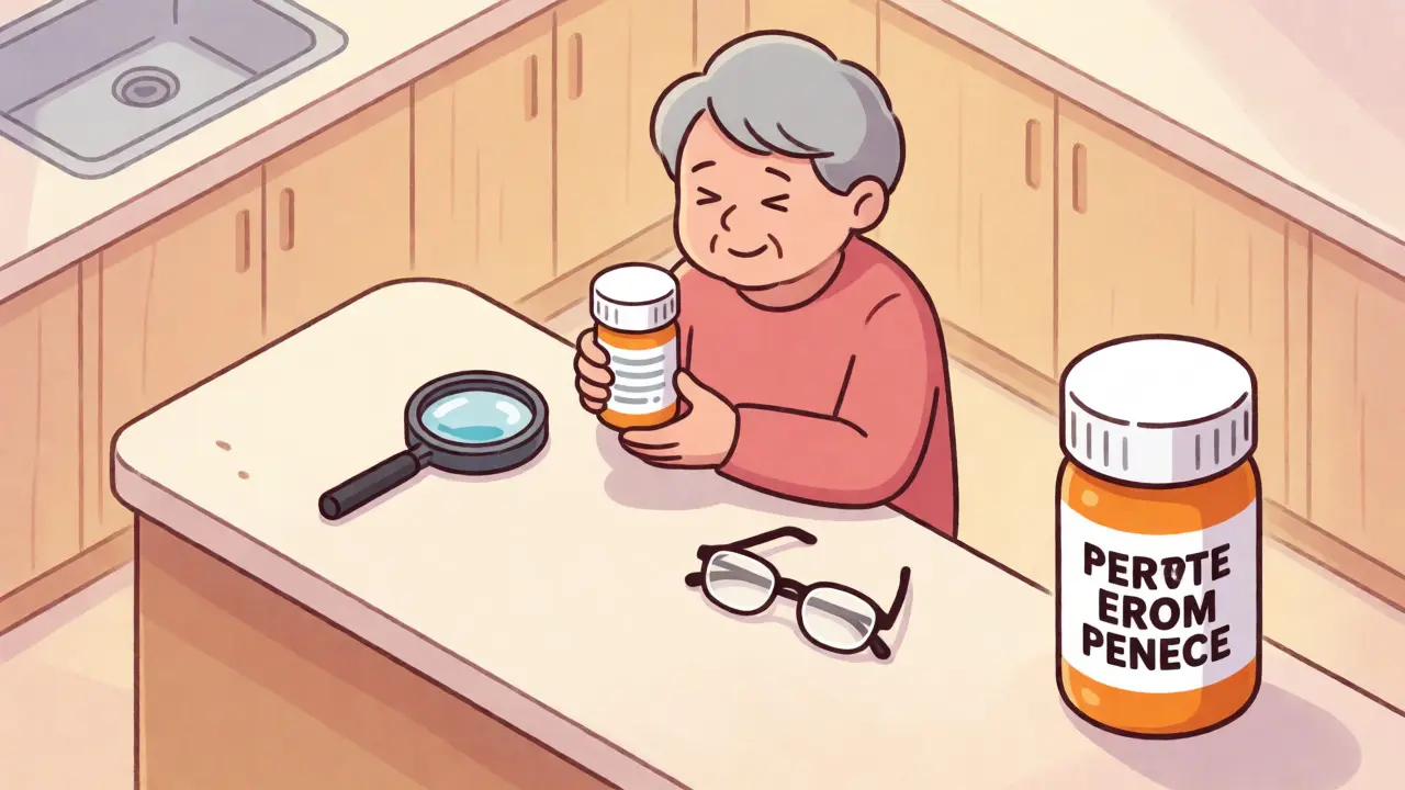
You are standing in your kitchen, holding a pill bottle. The text is tiny. You squint, bring it closer to your face, maybe even grab your reading glasses, but the words still blur into a gray smudge. This isn't just an inconvenience; for millions of people with low vision, it’s a daily gamble with their health. Are you taking the right dose? Is this the blood pressure med or the cholesterol one? The stakes are high, and the solution has been legally mandated since 2012, yet many patients still struggle to get it.
The FDA Safety and Innovation Act requires pharmacies to provide accessible information on prescription containers. But knowing the law exists doesn’t help if your local pharmacist shrugs when you ask for help. This guide breaks down exactly what accessible labels look like, why standard ones fail, and how you can demand the clarity you deserve to stay safe and independent.
Why Standard Labels Fail Low Vision Readers
Most prescription labels are designed for average sighted adults, not those with visual impairments. They typically use fonts between 8 and 10 points, which is microscopic for someone with macular degeneration, glaucoma, or diabetic retinopathy. Research published by the National Center for Biotechnology Information confirms that most individuals with moderate visual impairment cannot read fonts smaller than 14 point. When you force these users to decipher 9-point Arial on a curved plastic surface under fluorescent lights, errors happen.
The American Foundation for the Blind (AFB) highlights a terrifying reality: visually impaired individuals often take the wrong medication, the wrong amount, or miss doses entirely because they simply can’t read the instructions. It’s not about being careless; it’s about bad design. Without clear access to label info, you risk taking expired meds, missing refills, or failing to notice a pharmacy error. These aren't minor mistakes-they can lead to hospital visits or worse.
What Makes a Label "Accessible"?
An accessible label isn't just bigger text. It’s a specific set of technical standards designed to maximize readability. If you’re asking your pharmacy for large print, here is what you should expect to see:
- Font Size: The gold standard is at least 18-point font. Some experts recommend up to 24 points depending on the severity of vision loss.
- Font Type: Stick to sans serif fonts like Arial, Verdana, or APHont™. These letters have clean lines without decorative flourishes, making them easier for the brain to process quickly.
- Contrast: High contrast is non-negotiable. Black text on a white background works best. Avoid yellow-on-white or gray-on-gray combinations, which cause glare and eye strain.
- Layout: Left-justified text is easier to track than centered text. Lowercase letters are generally more readable than all-caps, except for critical numbers or warnings.
Because standard vials don’t have enough space for 18-point text plus all the required legal info, pharmacies often use a "duplicate label" system. This means you might get two labels on the same bottle-one standard, one large print-often connected by a colored sticker so you know they belong together. Don’t be alarmed if it looks cluttered; it’s a workaround for physical limitations.
Beyond Large Print: Tech Solutions for Independence
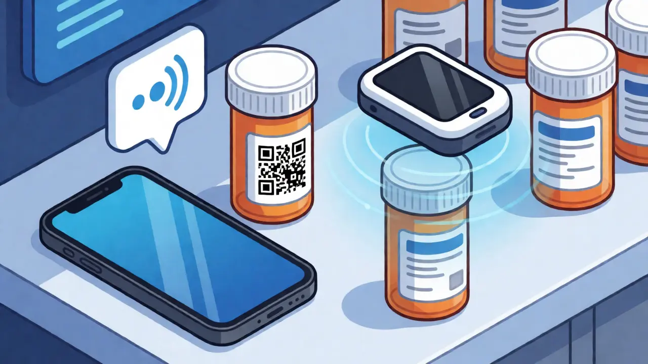
If large print isn’t enough, technology offers powerful alternatives. Two major systems dominate the US market: ScripTalk and QR-code-based apps like ScriptView.
ScripTalk uses Radio Frequency Identification (RFID). Your pharmacy writes the prescription details onto a small electronic tag embedded in the label. You buy a reader device (or use a smartphone app) that scans the bottle and reads the instructions aloud. It tells you the drug name, dosage, and expiration date. It’s fantastic for blind users who rely on audio, but it requires carrying a separate device or having a compatible phone. It also costs extra-sometimes around $50-$100 for the initial reader setup, though some chains offer it free.
QR code solutions are gaining traction. Pharmacies like UK HealthCare use systems where a QR code on the label links to an audio file via a mobile app. This leverages the smartphone everyone already carries. However, it demands digital literacy. If you struggle with app navigation, the learning curve can be frustrating. Still, for tech-savvy seniors, it’s a sleek, no-hardware-needed option.
| Feature | Large Print | ScripTalk (RFID) | QR Code/Audio App |
|---|---|---|---|
| Best For | Mild to Moderate Low Vision | Blind or Severe Low Vision | Tech-Savvy Users with Smartphones |
| Cost | Usually Free | $50-$100 Device Cost | Free (App Required) |
| Equipment Needed | None | Reader Device or NFC Phone | Smartphone + Internet |
| Independence Level | High (if legible) | Very High | Medium-High |
| Main Drawback | Space constraints on bottle | Requires charging/carrying device | Dependent on battery/internet |
How to Get These Labels: A Step-by-Step Plan
Don’t wait for your pharmacist to offer these options. Many independent pharmacies aren’t even aware they can provide them, or they assume you’ll manage with magnifiers. You need to advocate for yourself.
- Call Ahead: Before your next refill, call your pharmacy. Ask specifically: "Do you offer 18-point large print labels? Do you support ScripTalk or audio labels?"
- Be Specific: If they say yes to large print, confirm the font size. "I need at least 18-point Arial." If they only do 14-point, ask if they can print a separate sheet taped to the bottle.
- Request Consistency: Ask them to add a note to your profile so every future prescription automatically gets the accessible format. You shouldn’t have to fight this battle every month.
- Check the Result: Pick up your meds and inspect the label immediately. If it’s too small or hard to read, return it. Most pharmacies will reprint it without fuss once you point out the issue.
- Explore Alternatives: If your current pharmacy refuses or can’t comply, consider switching to a chain like CVS, Walgreens, or Walmart, which have higher adoption rates of accessible labeling due to corporate mandates.
The Legal Right Behind the Request
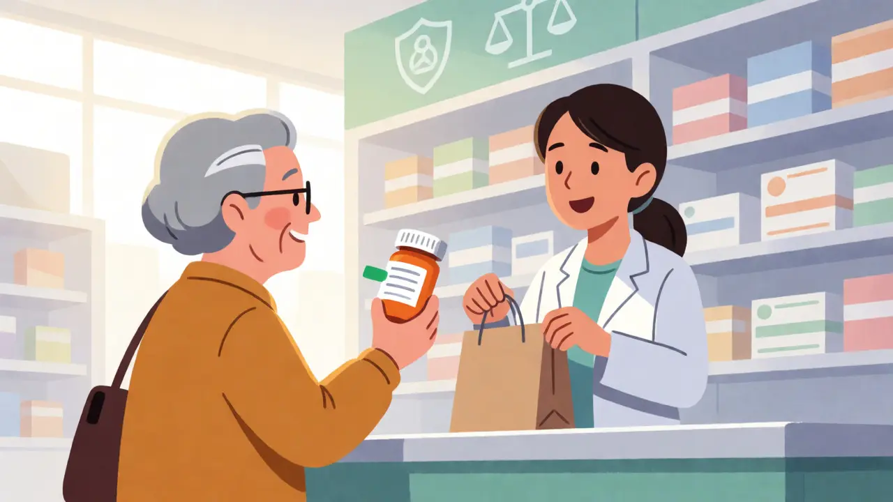
You aren’t asking for a favor; you’re exercising a right. The Department of Justice clarified in 2022 that failing to provide accessible prescription labels can violate Title III of the Americans with Disabilities Act (ADA). While enforcement varies, the legal backing gives you leverage. If a pharmacist dismisses your request, mention the ADA compliance requirements regarding effective communication. In recent years, settlements totaling hundreds of thousands of dollars have resulted from complaints about inaccessible healthcare services, including labeling.
Furthermore, the FDA’s push for health equity emphasizes that accessible labeling is critical for people with sensory disabilities. It’s not just about convenience; it’s about equal access to healthcare outcomes. Studies show that using accessible labels reduces medication-related emergency room visits by nearly 38% among visually impaired patients. That’s a massive improvement in quality of life and healthcare costs.
Common Pitfalls and How to Avoid Them
Even when pharmacies try to help, things go wrong. Here are the most common issues reported by patients:
- Inconsistent Implementation: One visit you get large print, the next you get standard. Solution: Always verify the label before leaving the counter.
- Glare Issues: Some pharmacies use glossy paper that reflects light, making black text invisible under bright lights. Solution: Ask for matte finish media if available, or read the label in natural light.
- Coverage Problems: Duplicate labels sometimes cover the barcode or important warning stickers. Solution: Ensure the pharmacist places the large print label where it doesn’t obscure other critical data.
- Staff Ignorance: New technicians may not know how to activate ScripTalk tags. Solution: Provide a brief explanation or show them the patient education materials provided by the pharmacy chain.
Remember, 67% of visually impaired patients report having experienced at least one medication error due to poor labeling. You are not alone in this frustration. By taking proactive steps, you shift the burden from your eyes to the system, where it belongs.
Is large print labeling free?
In most major US pharmacy chains, large print labels are provided free of charge as part of standard service. Audible technologies like ScripTalk may require purchasing a reader device, though some insurers or state programs might subsidize this cost. Always check with your specific pharmacy.
Can I get Braille labels instead of large print?
Yes, but availability is lower. Only about 10% of blind individuals read Braille, so fewer pharmacies stock Braille printers. You must specifically request it, and there may be a delay in filling the prescription while the label is printed. Large print is generally faster and more widely available.
What if my pharmacy says they don't offer accessible labels?
First, ask to speak to the pharmacist-in-charge. Sometimes front-desk staff are unaware of the options. If they truly cannot provide it, you have the right to transfer your prescriptions to a pharmacy that does. Major chains like CVS and Walgreens have robust accessibility programs.
Does the FDA require accessible labels?
Yes. The FDA Safety and Innovation Act of 2012 mandates that prescription container labels must be accessible to individuals with visual impairments. This includes providing information in formats such as large print, Braille, or audible means upon request.
How big should the font be on a prescription label?
The American Foundation for the Blind recommends a minimum of 18-point font for large print labels. Standard labels are usually 8-10 points. Anything below 14 points is often unreadable for people with moderate low vision.


